Improving the user experience for requesting virtual appointments
It can be difficult to get an appointment with your family doctor in Canada. Often, scheduling is done weeks in advance, and patients wait for hours to be seen. Many patients avoid this all together by not going at all.
VirtualCare aims to solve this problem by providing a cross-platform application for patients and doctors to have virtual appointments.
Product design for VirtualCare started in October 2017 while employed at Think Research. The desktop app launched in March 2018. Native mobile apps launched in May 2018.
User TestingUser ExperienceInteraction DesignUser Interface DesignMotion Design
My Role
As the lead designer for VirtualCare, I worked with clients, users, and internal teams to research, ideate, design, test, and plan the overall design, new features, and improvements for VirtualCare’s desktop and native mobile apps.
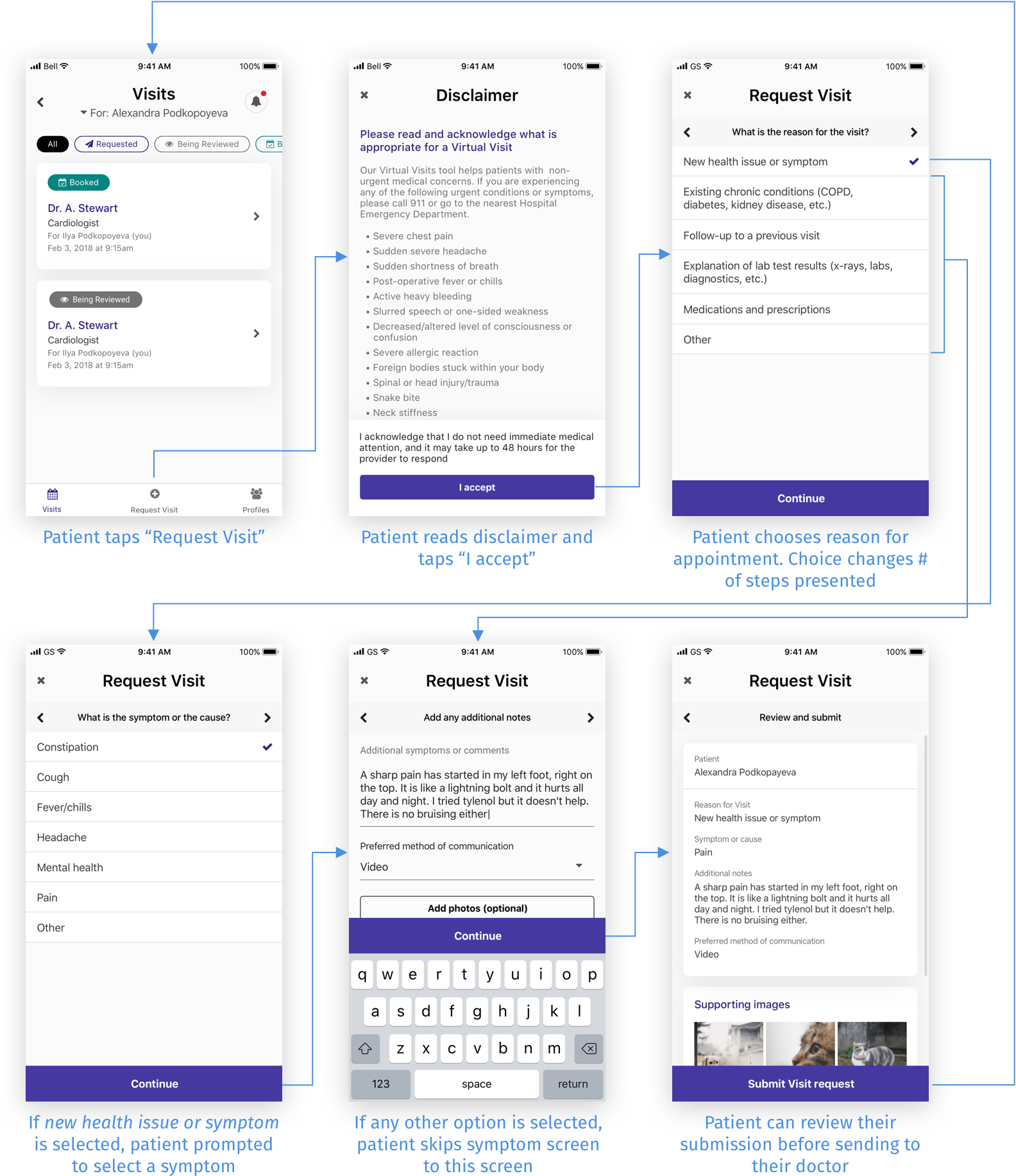
One improvement I initiated and undertook was improving the workflow around patients requesting appointments with their doctor.
Discovering Usability Issues
Since designs were rushed to meet deadlines, the design team and I suspected there may be usability issues. We conducted user testing on the patient-facing mobile app to uncover and identify them.
With 50-70 new appointments being requested every week, and 400 new patients registering every month, I felt it crucial to solve the problems we found around a primary workflow: a patient requesting an appointment with their doctor.
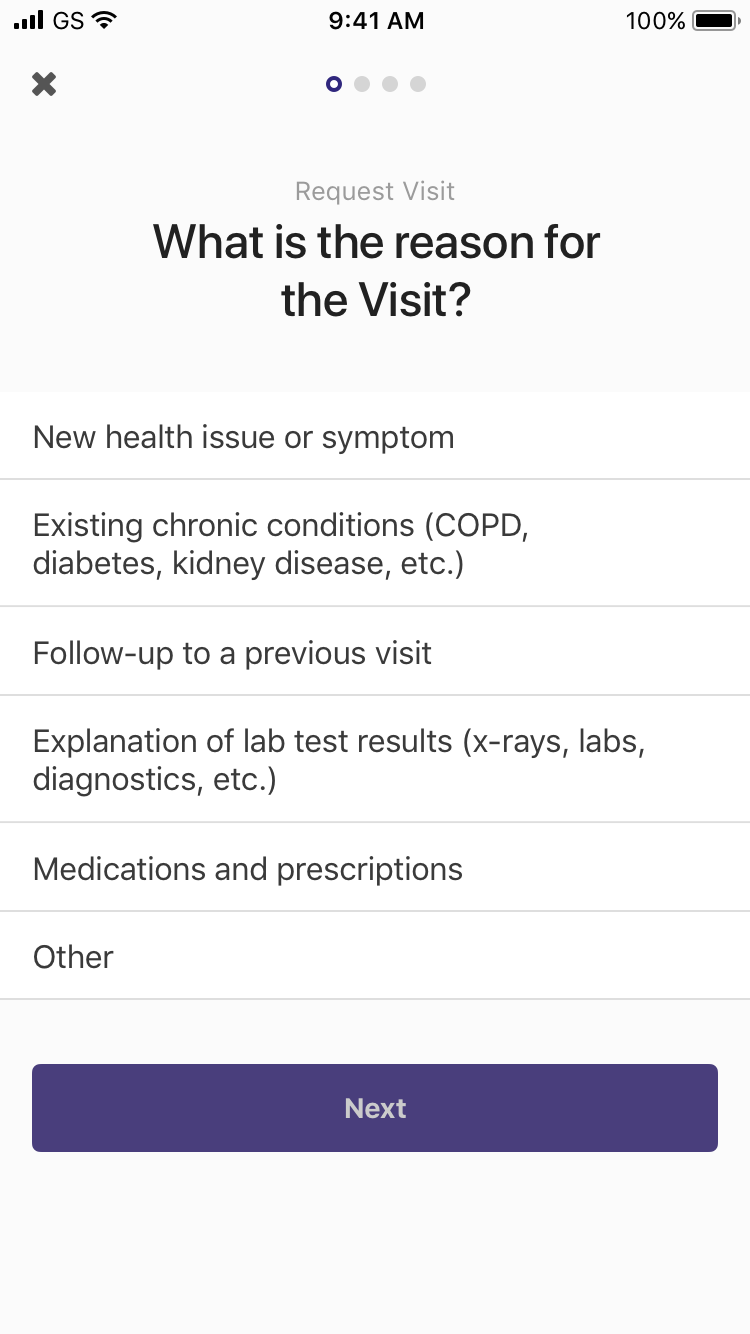
Appointment request workflow
The Problems
Three primary issues were identified that caused hesitation, confusion, and frustration in users:
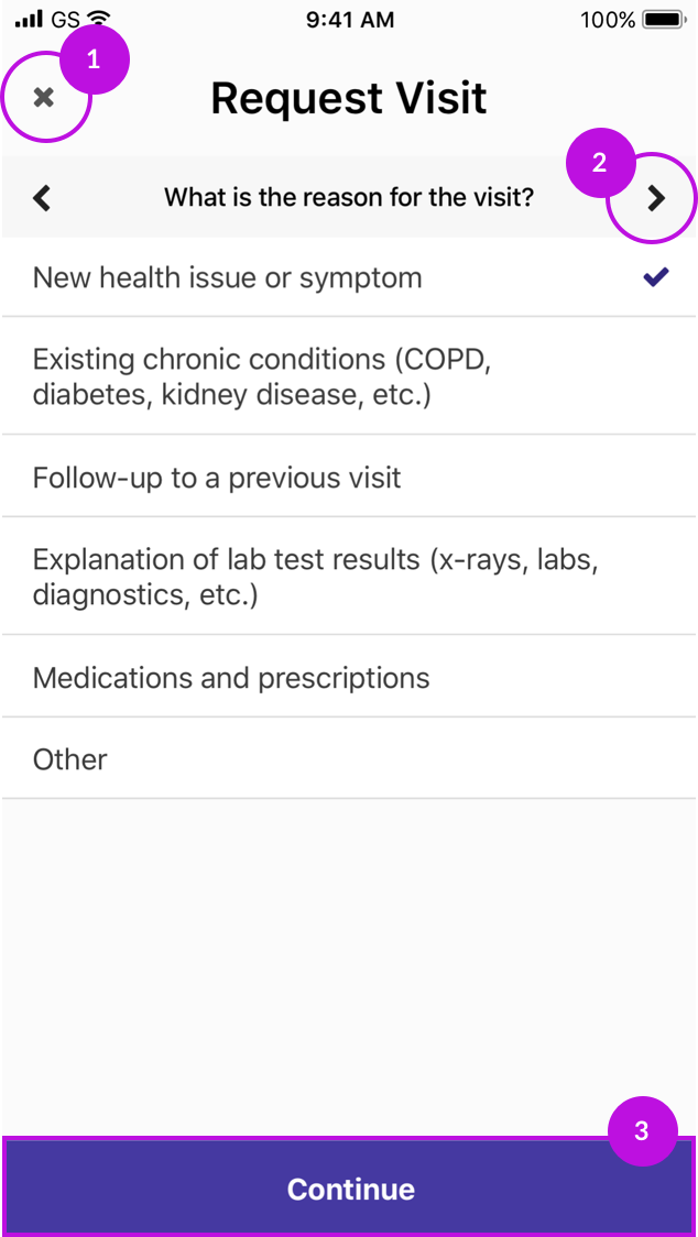
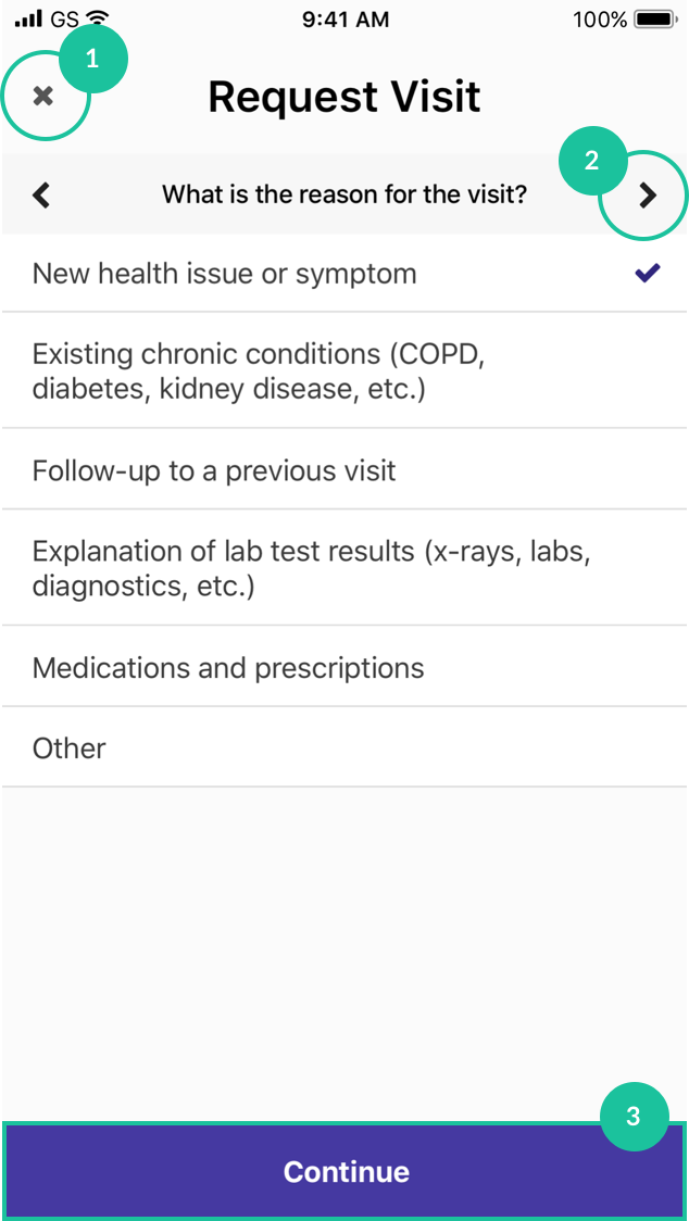
1) Users quit the workflow by accident when trying to go back.
2) Users didn’t know if the right arrow and Continue did the same thing or not.
3) Users weren’t sure if Continue would submit their request or go to another step.
How Might We’s
Using a “how might we” exercise, I reframed the problems into questions to help me think about possible opportunities:
1) How might we reduce the likelihood of patients exiting by accident?
2) How might we reduce the redundancy of the right arrow and Continue buttons?
3) How might we clarify what Continue does?
Hypothesizing & Prototyping
With an understanding of the problems, I wondered if changing the location of exit would solve problem #1, or if removing the arrow buttons would solve problem #1 & #2. I also wondered how users would try to go back if there were no explicit back button.
To find answers to my questions, I created 5 prototypes and tested them with iOS and Android users. I tweaked them along the way as I gained insight.
1) No arrows
2) Drag line to exit
3) Progression dots
4) Cards & bottom dots
5) Progress bar
Test Findings & Learnings
Drag line vs. “X” to exit
iOS users understood the drag line. Android users did not (they looked for the hardware back button or exited the app entirely). All users understood “X” to exit the flow.
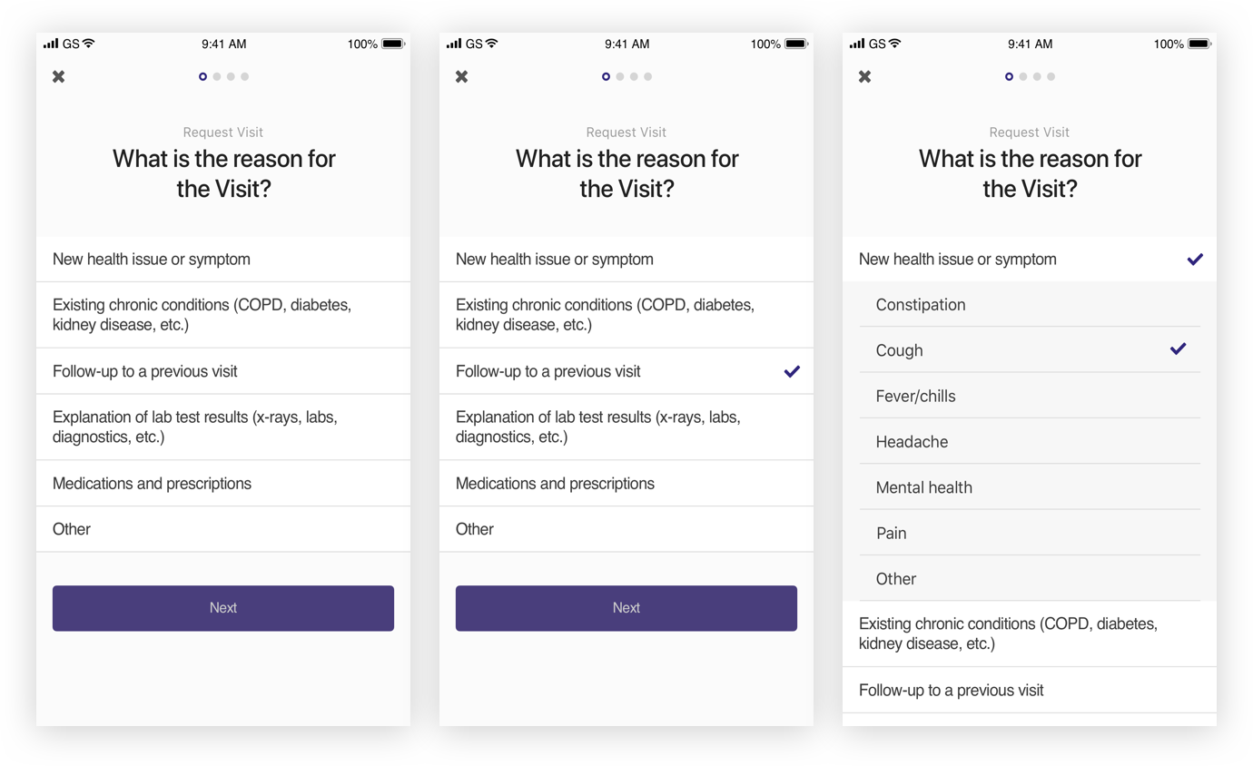
Progression dots
All users valued knowing the number of steps in the flow, but lost confidence when the number of steps changed. I would have to re-evaluate questions to eliminate the need for the number of steps to change.
Users also attempted to swipe backwards and forwards, and understood what “Next” would do when they saw the progression dots.
Progress bar
Users didn’t expect to be able to go backwards with the progress bar because, as one user said, “progress bars usually only go forward”.
Discovering the Right Solution
I explored 20+ different layout concepts, playing with size, position, content hierarchy and interactions with the keyboard and interface.
To solve the issue around the number of steps changing depending on the answer the user chooses, I combined the questions into one dynamic list. This prevented an additional page from being added, and helped set user expectations regarding the length of the workflow.
Stress-testing the Template
Due to the way the app was developed, the solution had to be flexible enough to work as a template across three other workflows. Designs with the most potential were stress-tested across the other workflows and evaluated on how well they could accommodate different layout needs.
Appointment request
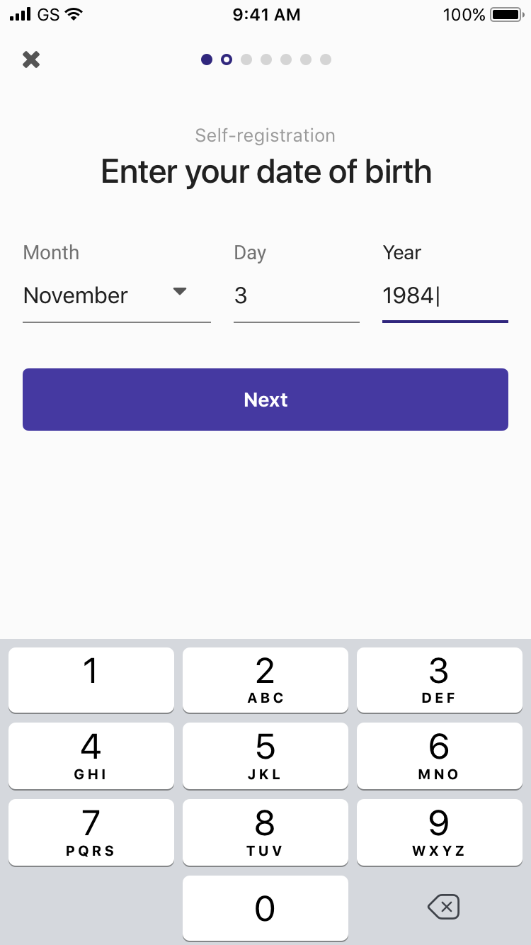
Self-registration
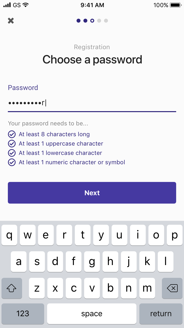
Registration
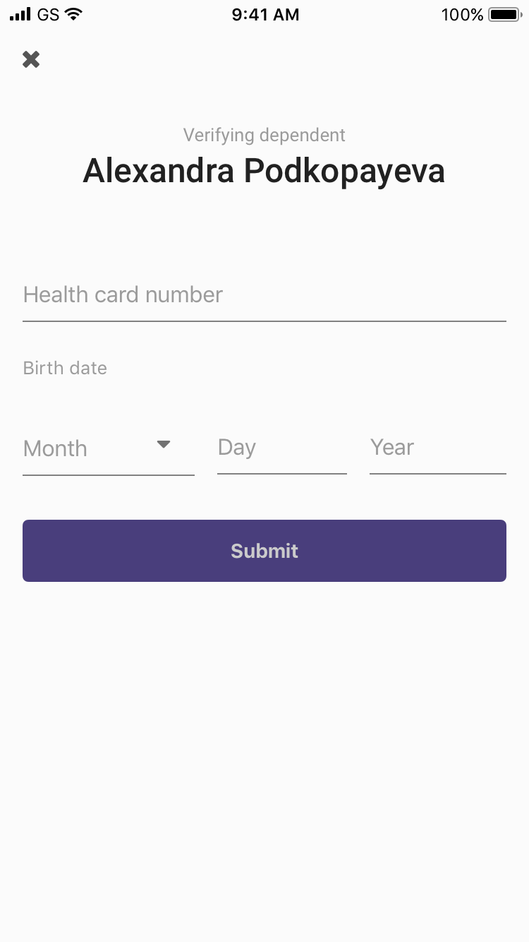
Verifying a dependent
The Improved Experience
The final designs not only improved usability and navigation of the appointment request workflow, but in the process, improved three other unrelated workflows too. They do this by:
1) Reducing the likelihood the user will exit the flow by accident when trying to go back a step
2) Visualizing a finite number of steps to help set expectations
3) Clarifing where the user is in the flow so they know what to expect from the Next button
4) Increasing the prominence of the question, allowing users to focus on the task at hand