Differentiating in an up-an-coming market
Marigold Medical Marijuana Co. is an boutique-sized organic medical marijuana grower and supplier for chronic illness patients in the Greater Toronto Area. As connoisseurs focused on quality over quantity, Marigold needed a brand for their business that would differentiate them from the competition and resonate with their customers.
Project completed in 2015 while employed at Pivot Design Group.
Art Direction
Research
Brand & Visual Design
Information Architecture
Web Design
Research & Art Direction
Through extensive marketplace analysis of other licensed medical marijuana growers in Canada, it was clear that most of their competitors were focused on presenting themselves as pharma.
Marigold’s focus on handcrafted taste and aroma, quality over quantity, personable customer service, and local organic farming was unique to the medical marijuana industry. Since marijuana is often viewed negatively, it was a challenge to communicate it as healing, flavourful and aromatic within Health Canada’s strict regulations on language and imagery.
The Process
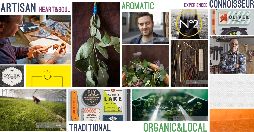
Moodboard: The brand’s look and feel
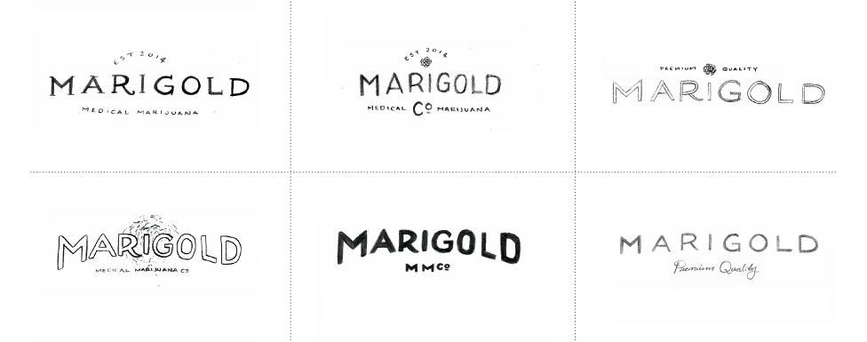
Inspiration: Hand-lettered typography
Sketches: Final concept directions
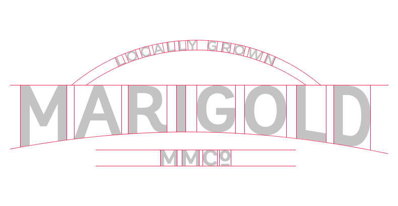
The Brand
Drawing inspiration from food and artisan culture resulted in a refined typographic and photographic approach that drives home the concept of local artisans focused on flavour, aroma and taste. Secondary identities, graphics and collateral were developed to support the main identity.