An inclusive brand for a national organization
In 2013, Canadian unions CEP & CAW merged to form Canada’s largest private sector union, representing 300,000 members in more than 20 sectors. As a new entity, the union needed a bilingual name and an identity that would represent their progressive goals, inclusive attitude and new outlook.
Project completed in 2013 while employed at Pivot Design Group.
Art Direction
Research
Brand & Visual Design
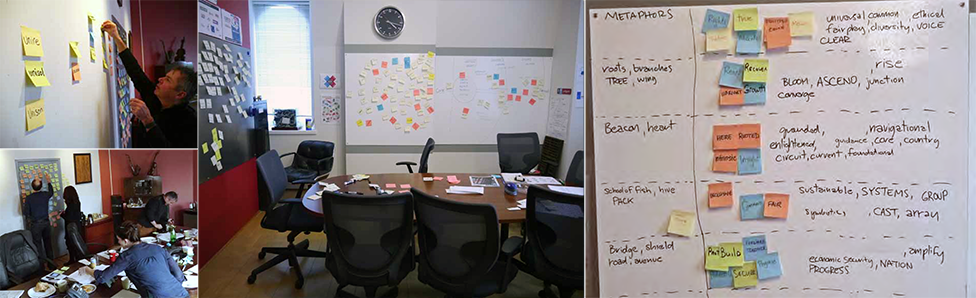
The Process
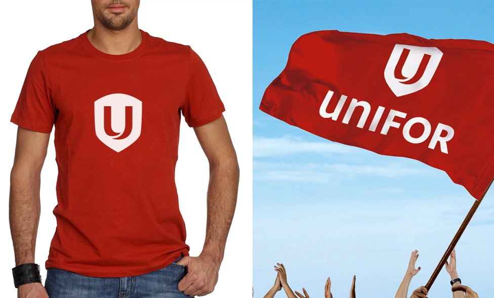
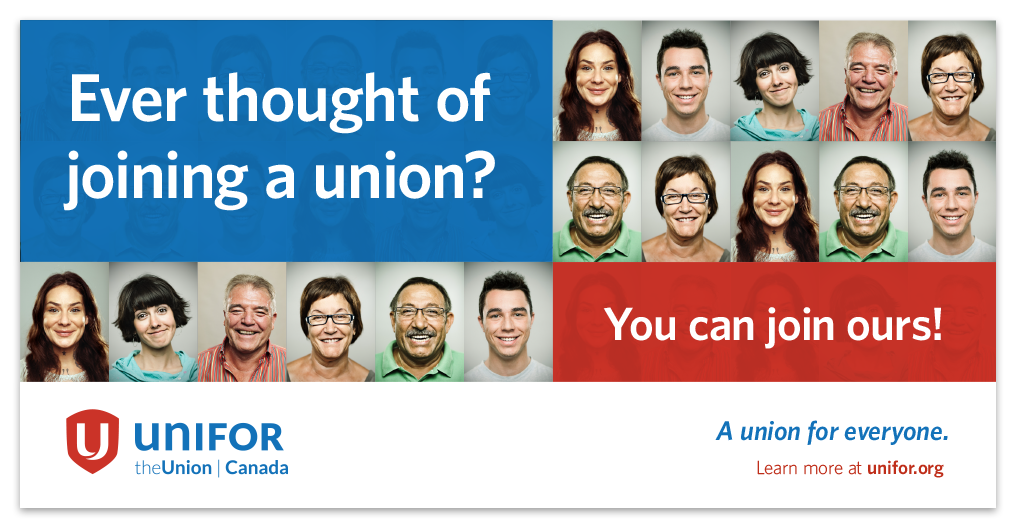
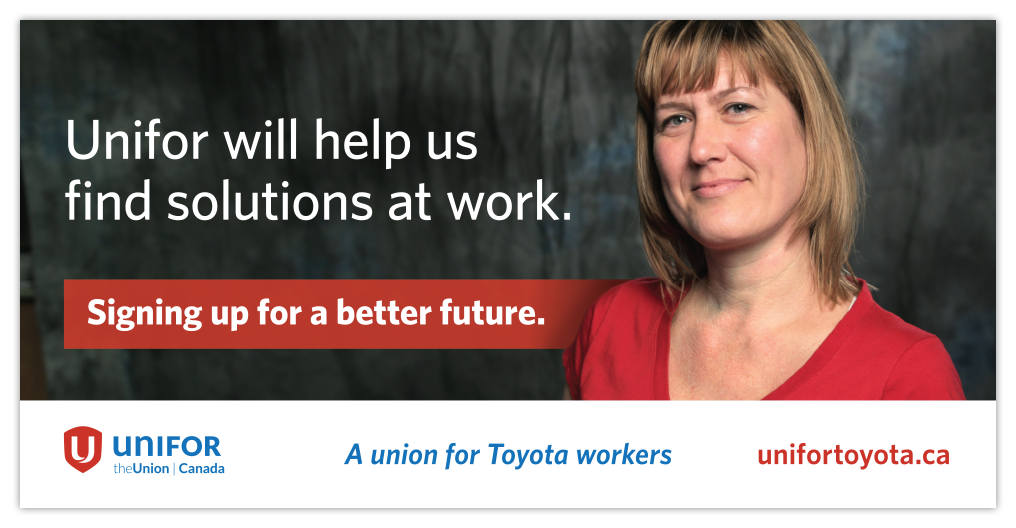
Working with consultants at Stratcom Strategic Communications, stakeholders chose the name Unifor. The brand look and feel focused on being personable and approachable instead of aggressive and confrontational. Representing real people in the union was key.
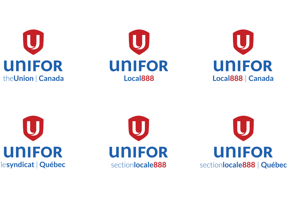
With over 700 locals post-merger, Unifor needed an identity system for regions and locals. I was responsible for developing the system and directing a design team in the creation of customized logo kits for each region and local.