Streamlining a distracting enterprise interface
Autodesk’s Maya is one of the most comprehensive 3D animation software applications. As a leader in the industry, Autodesk wanted to re-evaluate their user interface to humanize it and ensure Maya remained competitive, appealing and user-friendly in a growing market.
Project completed in 2014 while employed at Pivot Design Group.
Research
User Interface Design
The Problem
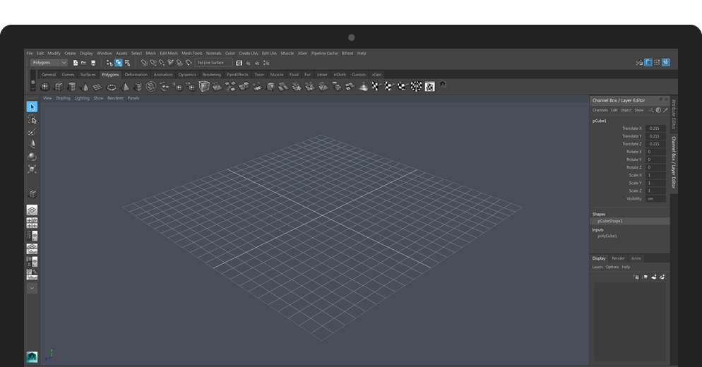
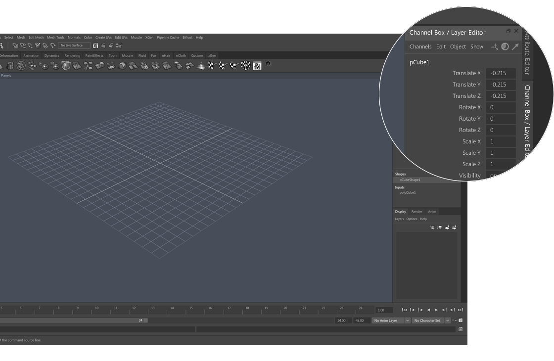
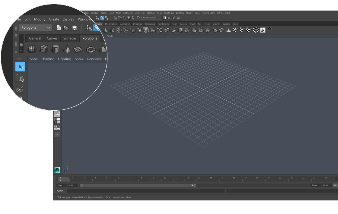
Maya’s interface became visually disconnected as the number of functions and tools grew over time. The user interface suffered from inconsistent icon design and colour palette, unclear hierarchy, poor legibility, mixed label alignment, and visual noise such as unnecessary dividers, spacers and textures.
The Research
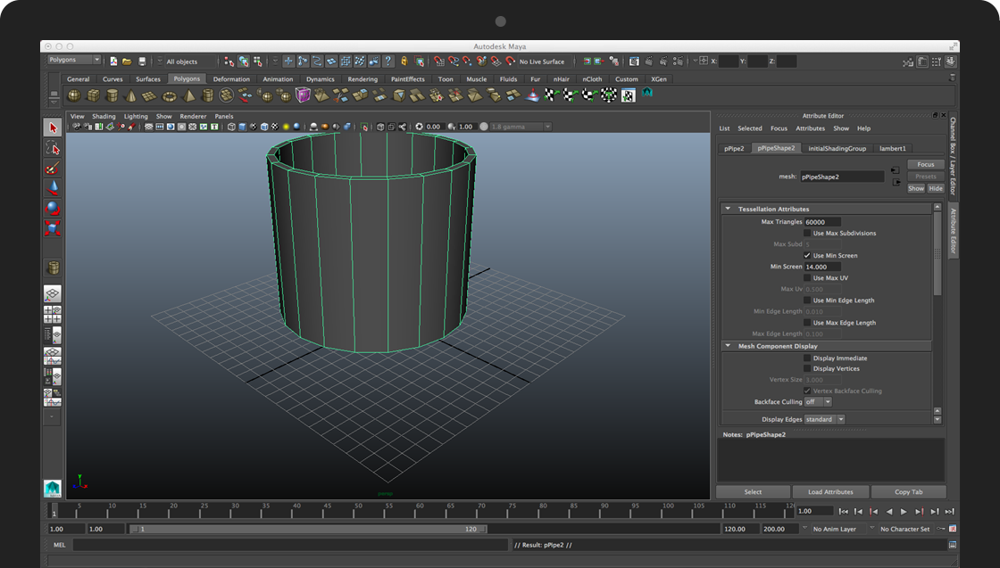
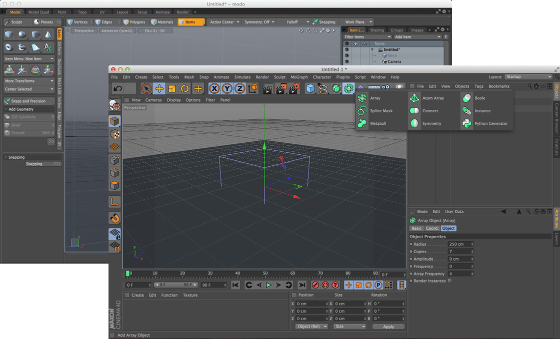
Through my research, it was clear that user interfaces of Maya’s top competitors’ were far more user-friendly. They used streamlined workflows, unobtrusive interfaces, clear hierarchy, consistent colour-coded icons, and legible typography appealing to both the novice and experience user.
With an understanding of successful design paradigms in the 3D modelling and animation space, it was clear what steps needed to be undertaken to improve the usability of Maya’s interface.
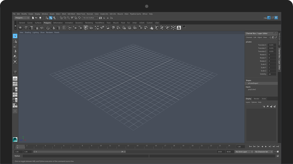
The Redesign
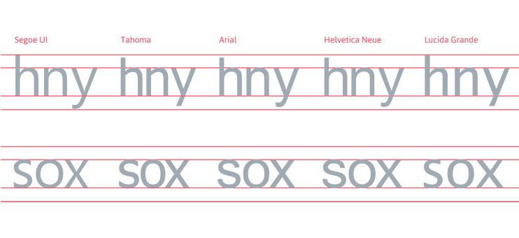
The result is both subtle and monumental. Clutter in the form of line breaks, textures, gradients and frames were replaced with visual white space. New colours are subtle enough to avoid distraction while working in the software, but obvious enough to create clear layers and frames. Type size, alignment and colour create hierarchy and order.
Based on the research, I also provided recommendations for creating a cohesive system of colour-coded icons to improve the grouping of similar functions and user work flows. Autodesk took this in-house for consideration.
In April 2015, Autodesk unveiled the new look for Maya 2016. The new installment featured my proposed interface designs and icon colour-coding recommendations. The new look and feel was well received by Maya users on YouTube.