Making self-diagnosis accurate and approachable
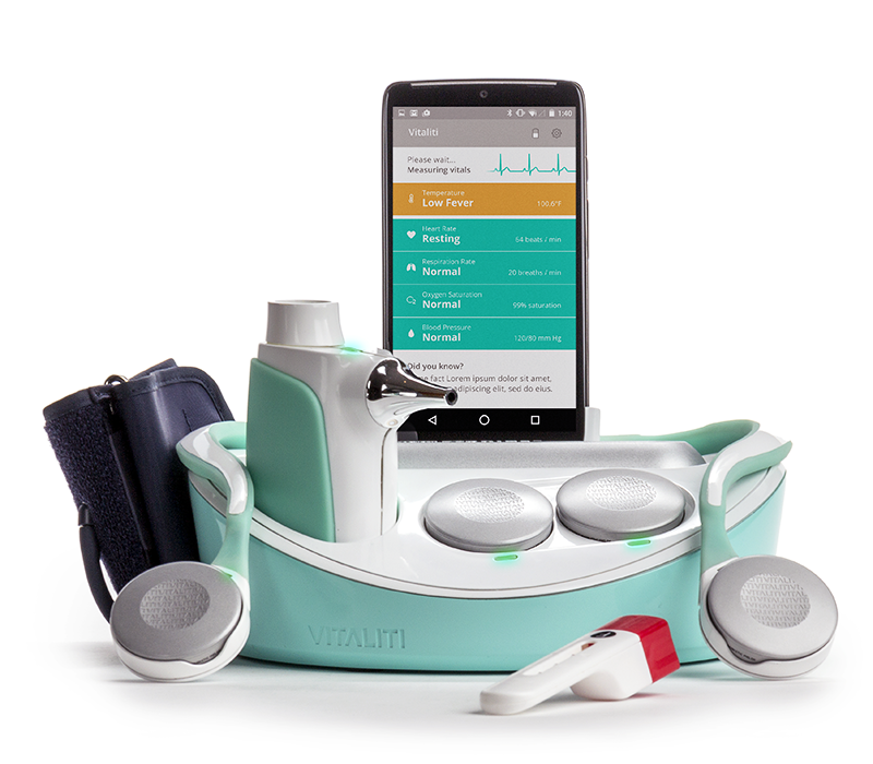
The Qualcomm Tricorder XPRIZE was an international competition to create an innovative consumer technology and mobile app to diagnose 15 medical conditions without a doctor.
Industrial design company, Cortex Design, approached Pivot Design Group in 2015 to join the Cloud DX XPRIZE team. As an integral member of the XPRIZE team, I led the design and user experience of the mobile application. Together with developers, industrial designers, physicians, scientists, and stakeholders, we worked together to create the best possible user experience.
Research
Strategy
Information Architecture
Interaction Design
User Interface Design
Visual Design
User Experience
Art Direction
The Research
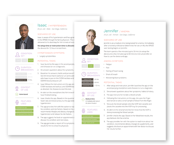
During my research into the healthcare and wearable tech industry, I identified two common issue: few apps helped users make sense of their data, and even fewer provided users with actionable next steps towards improving their health.
I planned to evolve the system to include these functions.
The Strategy
Since the industrial design had been the main focus, the team lacked a strategy for how to diagnose each medical condition.
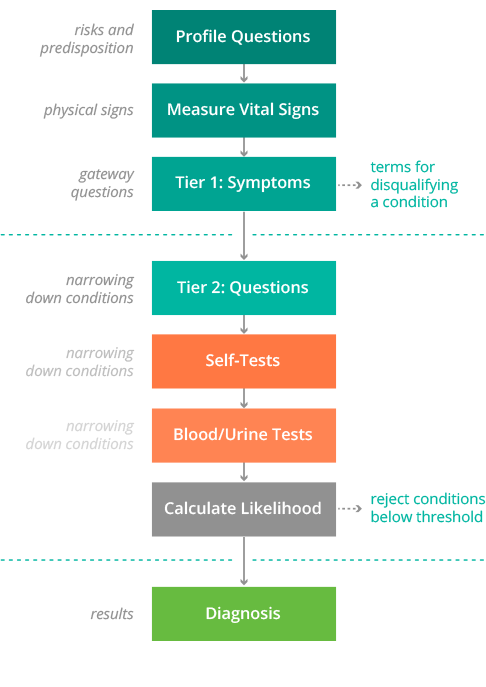
After thoroughly researching and mapping each condition’s risks and symptoms, I identified similarities and differences between each condition. With this understanding, I designed a diagnostic framework of tiered questions, vital sign readings, and tests to guide the diagnosis.
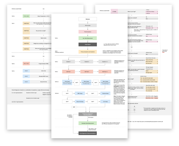
With the aid of the team’s physician, we used a combination of peer reviewed research, medical journals, likelihood ratios, scoring systems, and his personal experience to create a diagnostic algorithm for each condition based on my proposed framework.
The UI & Visual Design
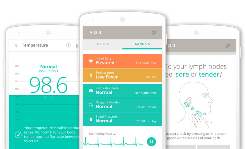
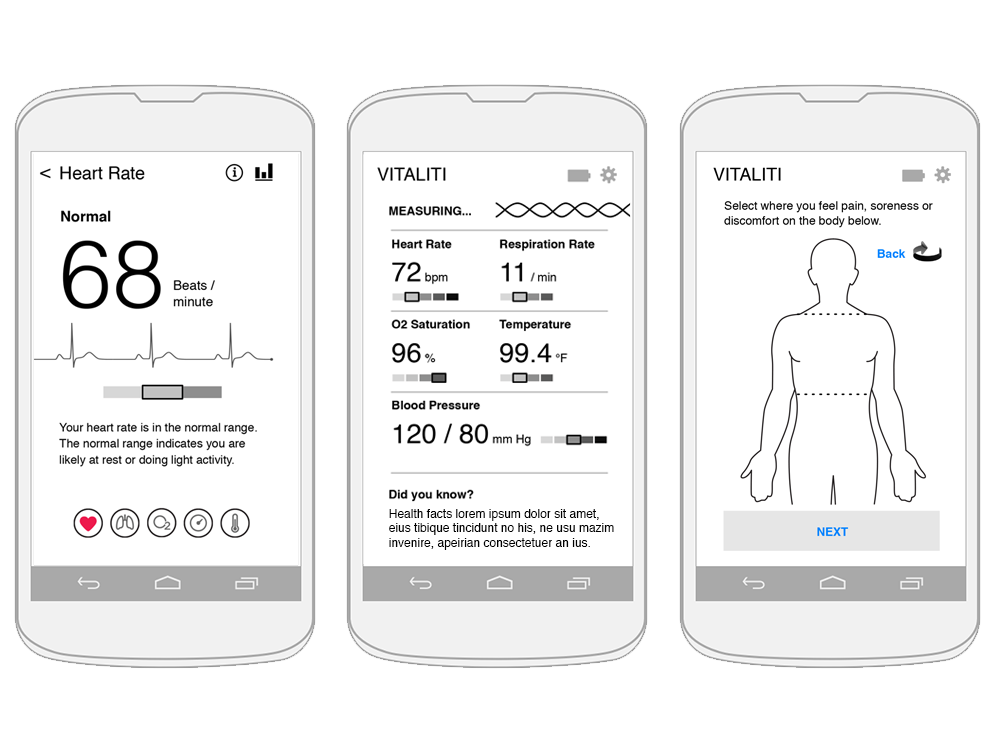
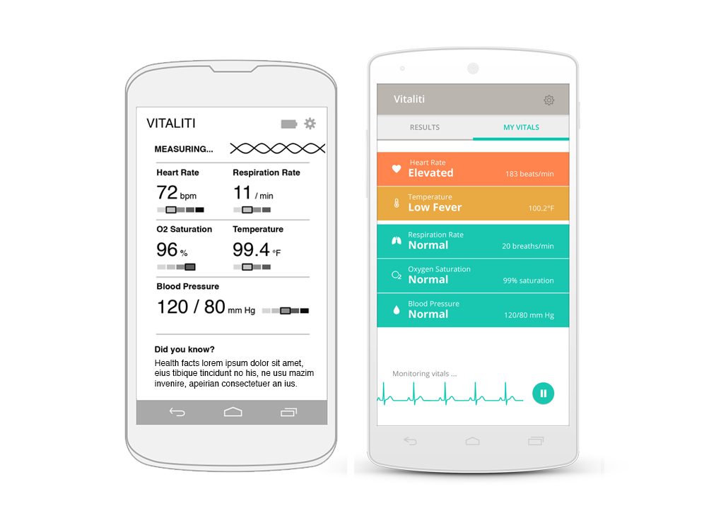
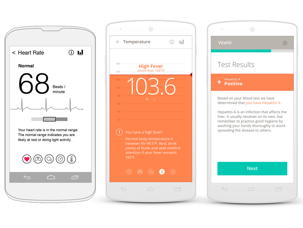
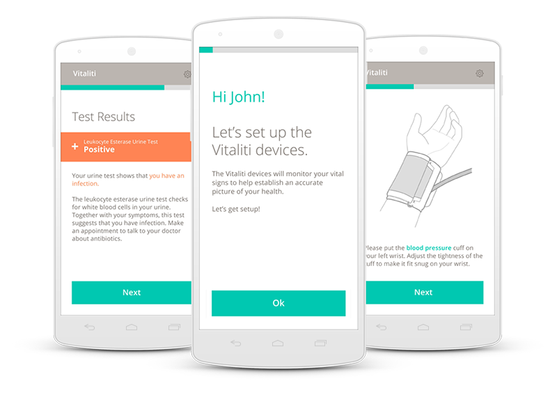
Keeping the user interface design clean and personable became my driving force in order to guide users through the diagnostic process within the time limits of the competition. Colours, typefaces language and custom diagrams were all carefully considered and used meaningfully in the user interface to make the product feel clinical, yet approachable and trustworthy.
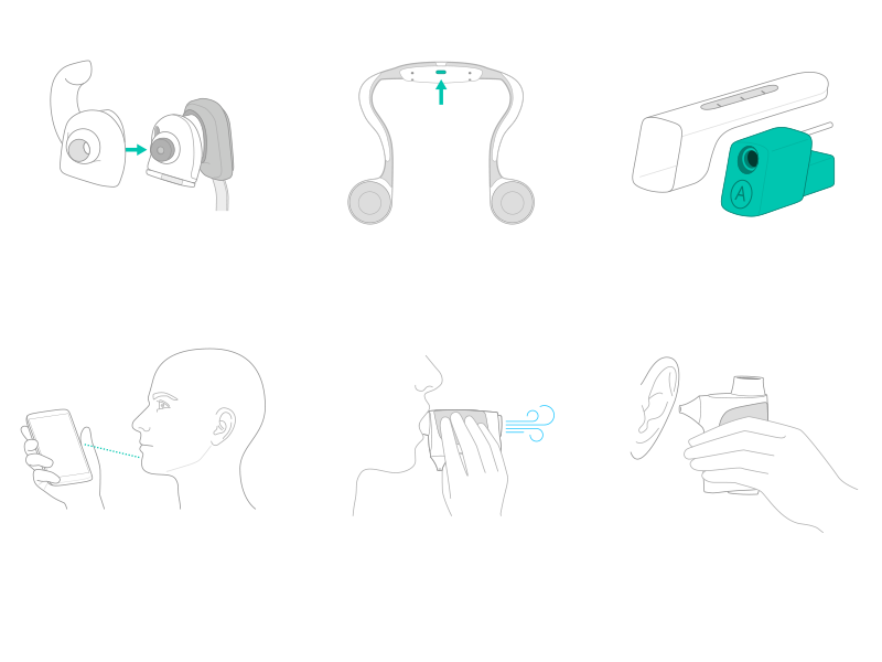
To ensure a consistent look and feel, I created over 60 custom diagrams and icons to communicate tasks to the user in a clear and efficient way.
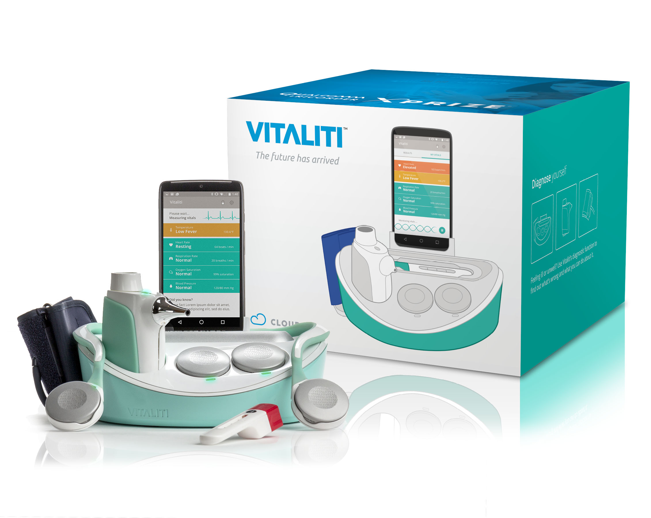
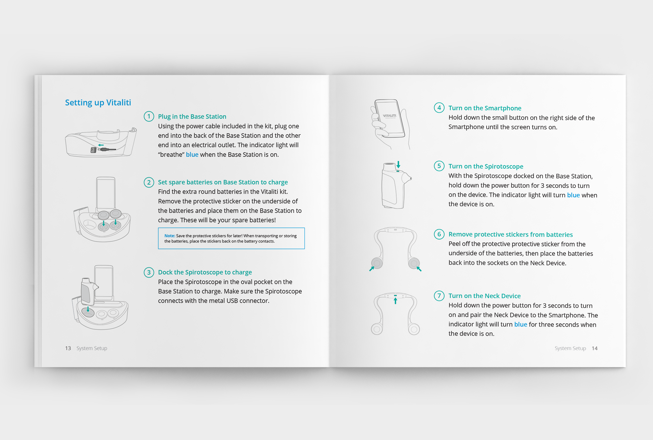
With the full user experience in mind, I also designed the packaging, labels, quick start guide, user manual, safety booklet, and an orientation video for the system.
